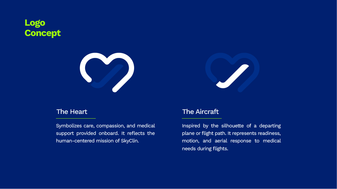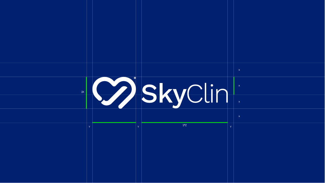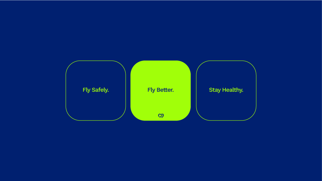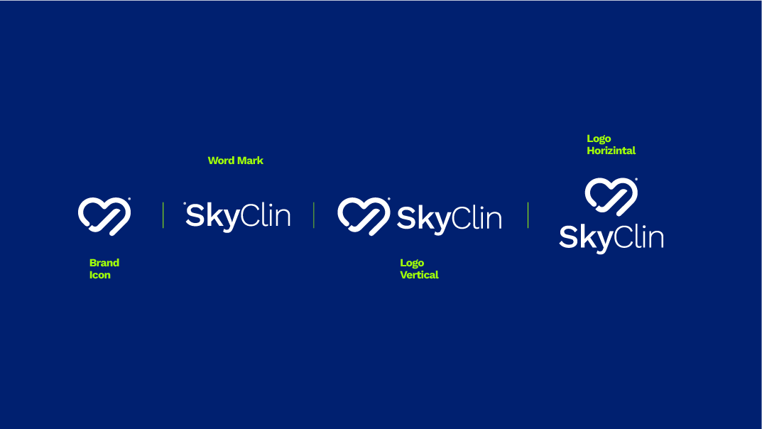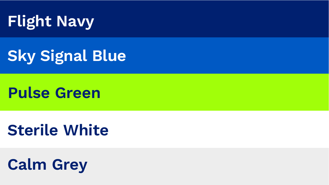
This case study showcases the creation of the SkyClin Visual Identity V1.0, developed for an innovative aviation-healthcare initiative. SkyClin connects certified doctors with airlines through its pioneering “Doctor on Board” program, ensuring passenger safety and medical readiness during flights.The logo is a conceptual fusion of a heart and an aircraft silhouette, symbolizing compassion, mobility, and care in the skies. This human-centered approach is further reinforced through clean typography and a professional color palette that includes:Flight Navy and Sky Signal Blue for trust and clarity,Pulse Green representing life and health,Sterile White and Calm Grey to reflect cleanliness and serenity.The visual identity system includes vertical and horizontal logos, a unique brand icon, and a flexible layout adaptable to digital and print mediums. Paired with Work Sans typeface, the identity ensures clarity, accessibility, and a sense of calm authority.SkyClin began with Royal Jordanian and aims to expand globally, setting new benchmarks for in-flight medical care. This branding system was crafted to support that mission—"Trusted care above the clouds."